Autonomy is shown, not implied
Every recommendation lists what Neuron does alone, what needs approval, and what it must never touch. WhyA promise about behavior builds more trust than a confidence score.
A working prototype that asks one question: if Neuron becomes the system of operational intelligence, how should that intelligence pass between people? Between shifts, and between the model and the operator who is accountable for what it recommends.
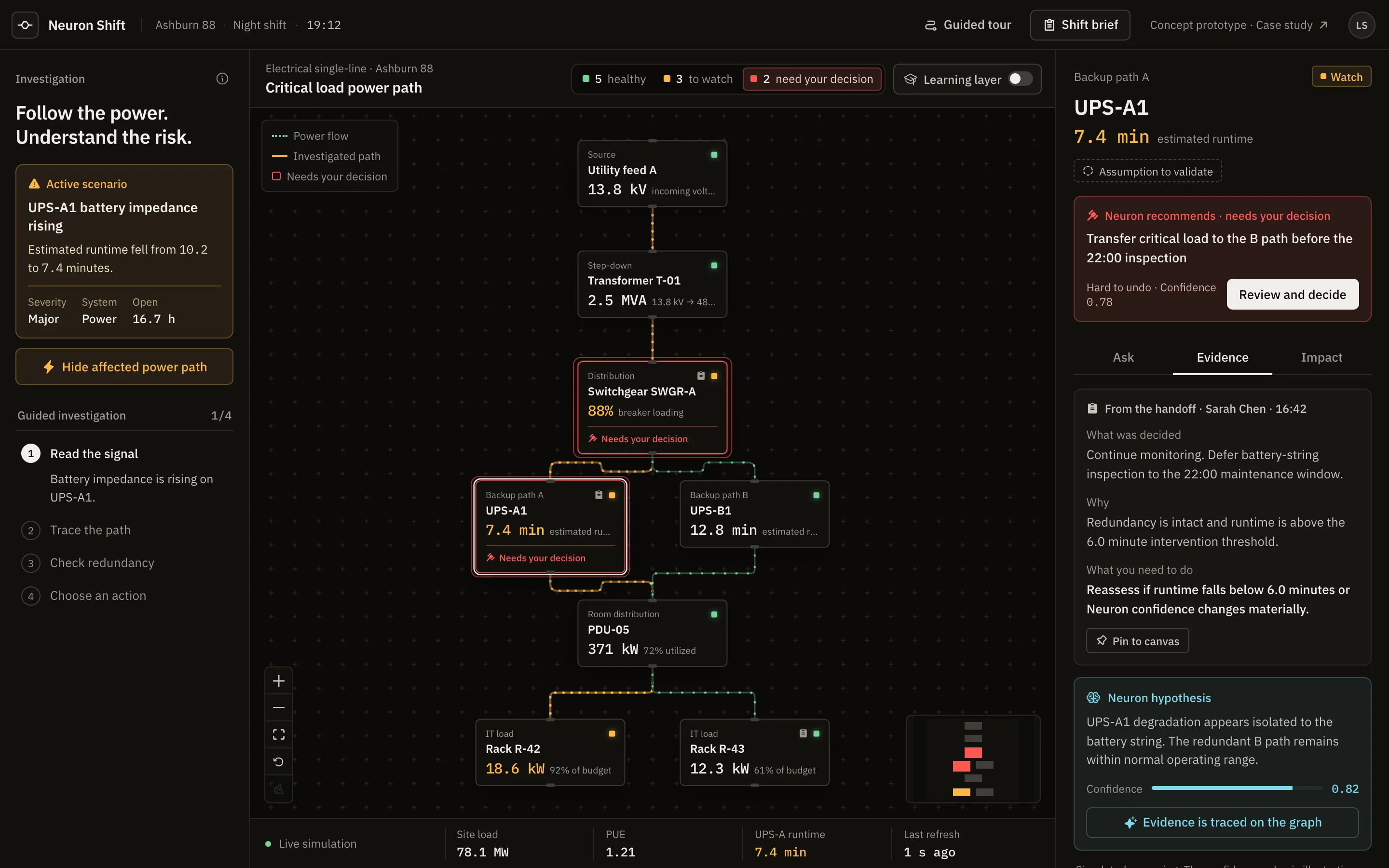
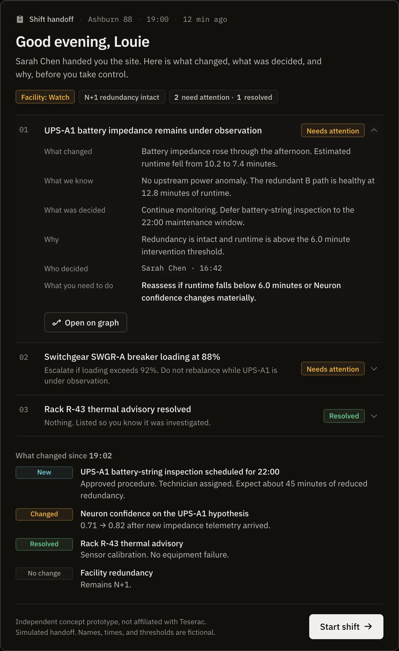
At 19:00 one operator goes home and another takes responsibility for the building. What changed? What was investigated and deliberately left open? What must the new operator not touch, because someone already decided otherwise?
Neuron already holds the telemetry, topology, incidents, and procedures. The gap is not data. Most systems keep what happened and lose why a person chose what they chose.
Do not only preserve knowledge for later search. Put the right knowledge into the exact moment responsibility changes hands.
The same applies to the model. Neuron proposes, the operator decides, and the decision and its reason become the record the next shift inherits.
One person, arriving rather than leaving, with a building to answer for.
This profile comes from public material and reasoning, not interviews. Whether six fields is the right shape, and whether "what you need to do" reads as help or as a peer giving orders, are questions for one conversation with one operator.
A single path an operator would walk at the top of a shift.
A chat box asks the operator for the question at the moment they have the least time and the least certainty about what to ask. Its answer does not attach to an asset, does not persist, and cannot be inherited. So every AI surface here follows three rules.
Chat is still good at the question nobody anticipated. A command bar that returns a reconfigured interface instead of a paragraph would keep that strength. I scoped it out.
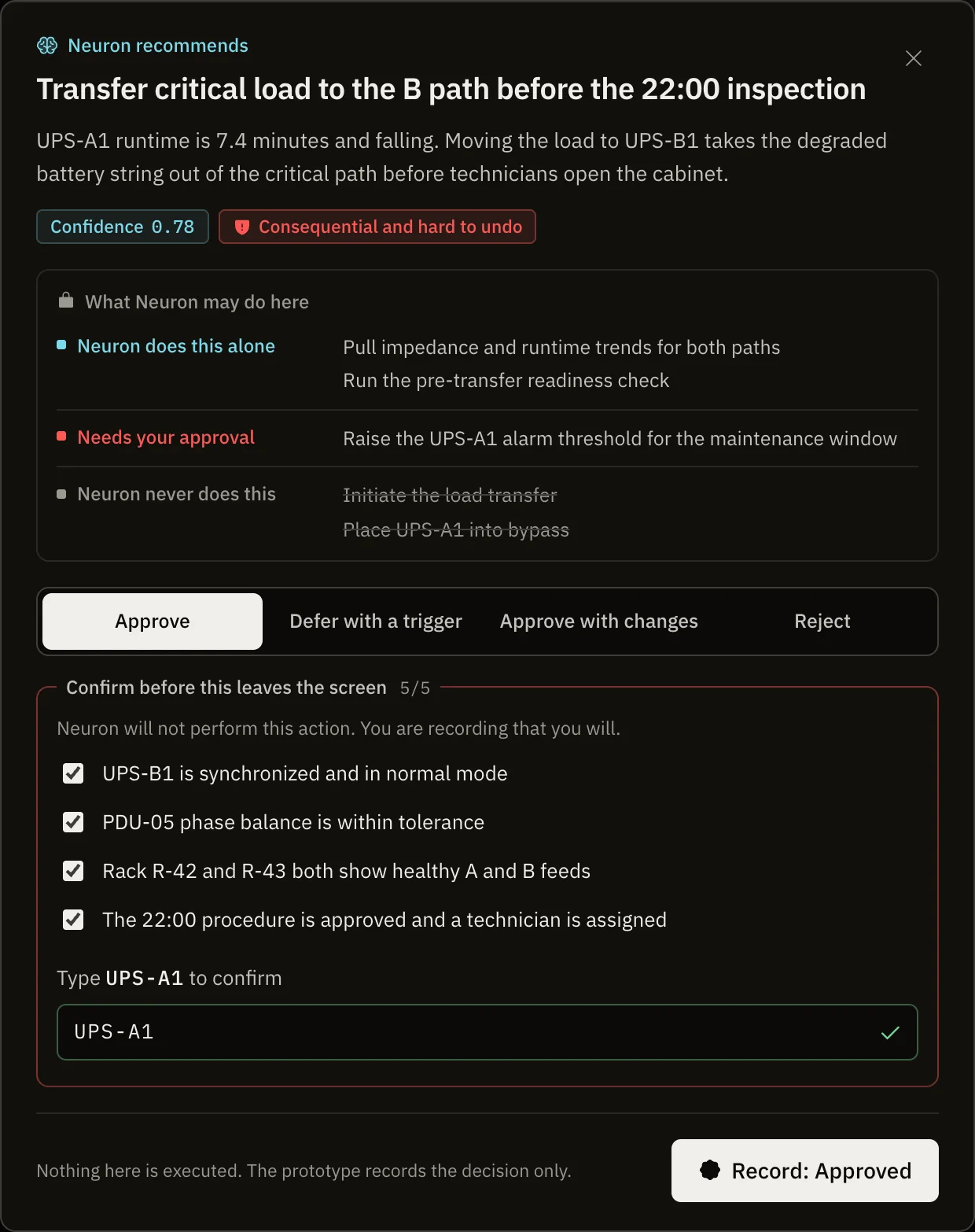
Every recommendation lists what Neuron does alone, what needs approval, and what it must never touch. WhyA promise about behavior builds more trust than a confidence score.
Raising an alert threshold is one click. Transferring critical load takes four checks and the asset name. WhyA one-click approve on a consequential action invites rubber stamping.
The choices are Approve, Defer with a trigger, Approve with changes, and Reject. Deferring names what brings it back. Overriding requires a reason. WhyIn operations the common right answer is "not yet". And an override is an expert disagreeing with the model, which is exactly the knowledge the industry is losing.
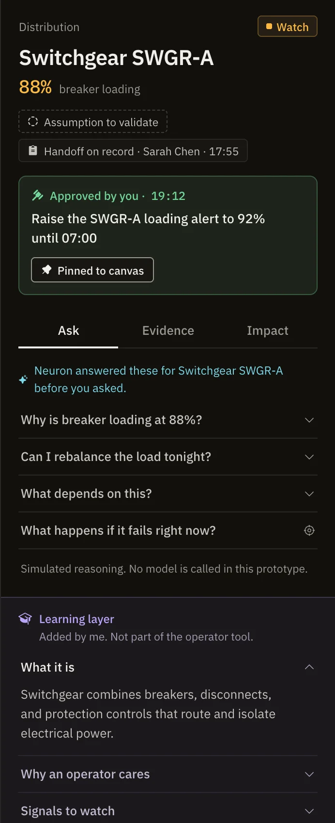
An earlier version taught the domain inside the operator tool. That was wrong. Real operators know what a PDU is. The teaching now lives in a separate violet layer, off by default. WhyI am not the user. My training wheels should switch off.
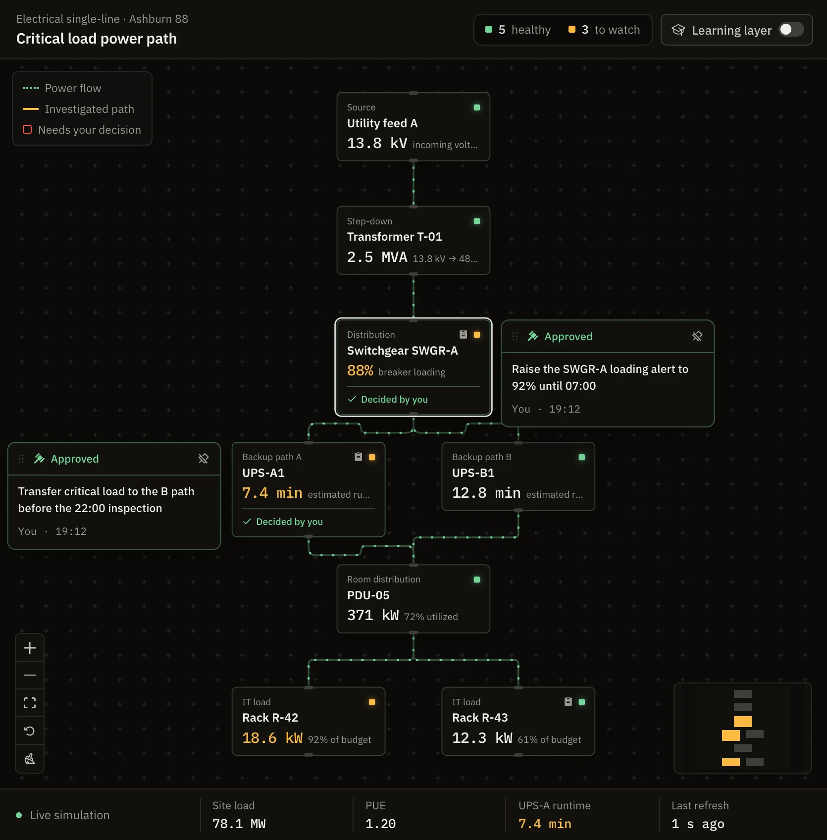
A recorded decision pins itself beside its asset, moves with it, and stays readable at any zoom. NextThe pinned arrangement should travel in the handoff too.
The first layout ran left to right in a tall canvas and rendered at about sixty percent zoom. One-line diagrams are usually drawn source at the top, load at the bottom. Following that convention made the graph readable on a laptop.
Power flows along live lines and stops where a failure would cut it. The graph powers up when you take the shift, marking the moment responsibility changes hands. Recording a decision settles one green ring on the asset.
The first version assumed I would present it. In a portfolio, nobody does.
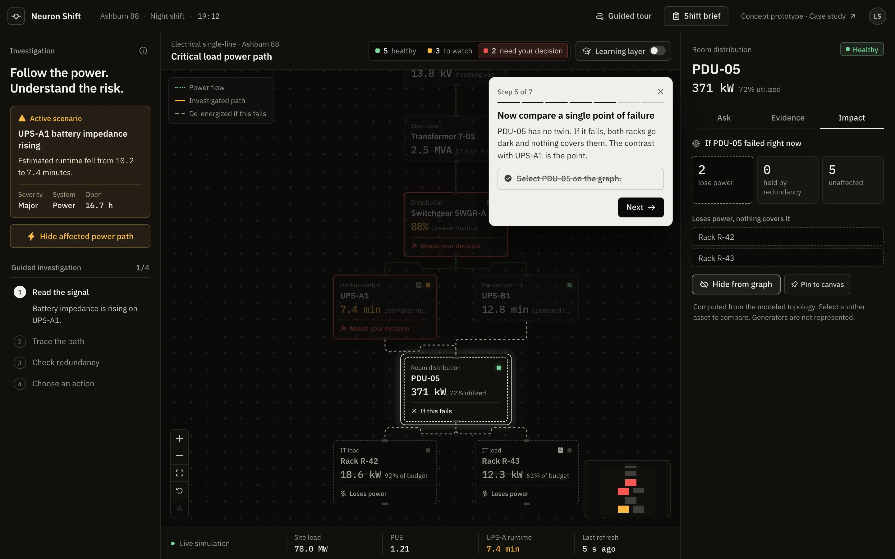
A visitor arrives from a link, has a couple of minutes, and does not know the domain. So the prototype makes its own argument. On a first visit, a guided tour opens beside the shift brief and covers the core ideas in seven steps.
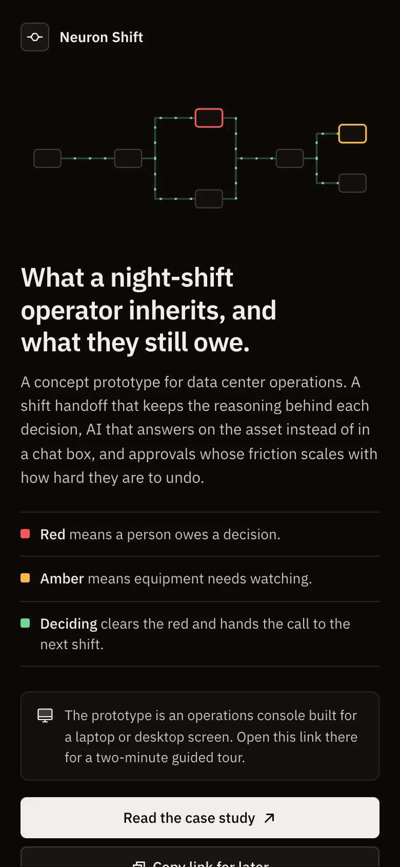
The console needs a laptop-sized screen. Below 1000 pixels, a visitor sees the idea, what the colors mean, and a link here, instead of a squeezed layout.
The chrome carries no hue at all. Color only ever means state.
Healthy power, and decisions that were made.
A state of the equipment.
A state of the work, not the plant. Deciding clears it.
Not a color, because loss of power is an absence.
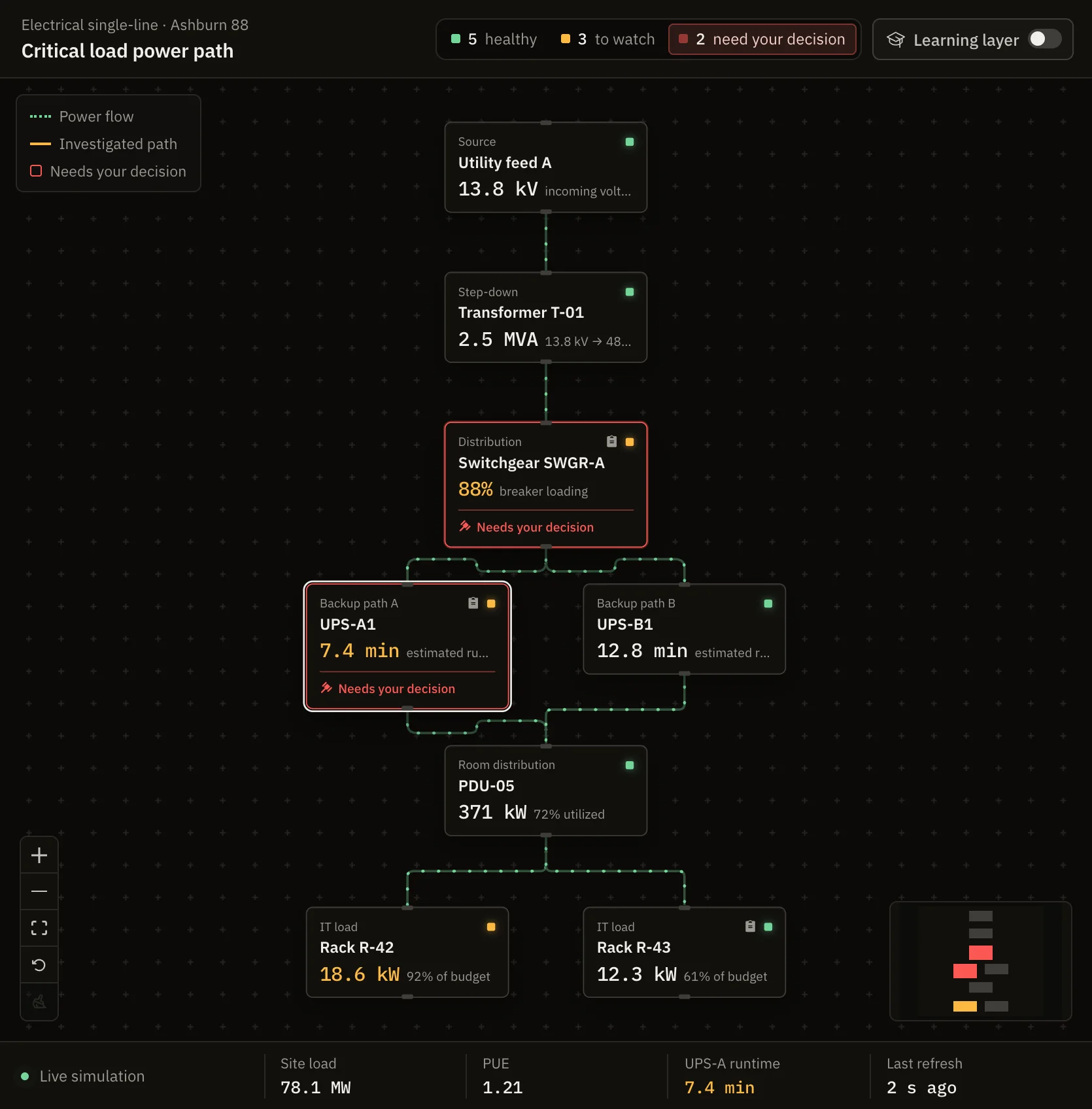
The proof case is Rack R-42. It sits at 92 percent of its budget and stays amber, because nobody owes a decision on it. The canvas shows where judgment is outstanding, not just where the plant is unhappy.
Before: two decisions owed
After: both decided and pinned
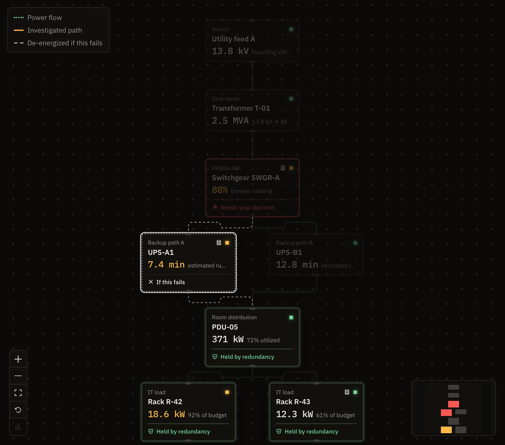
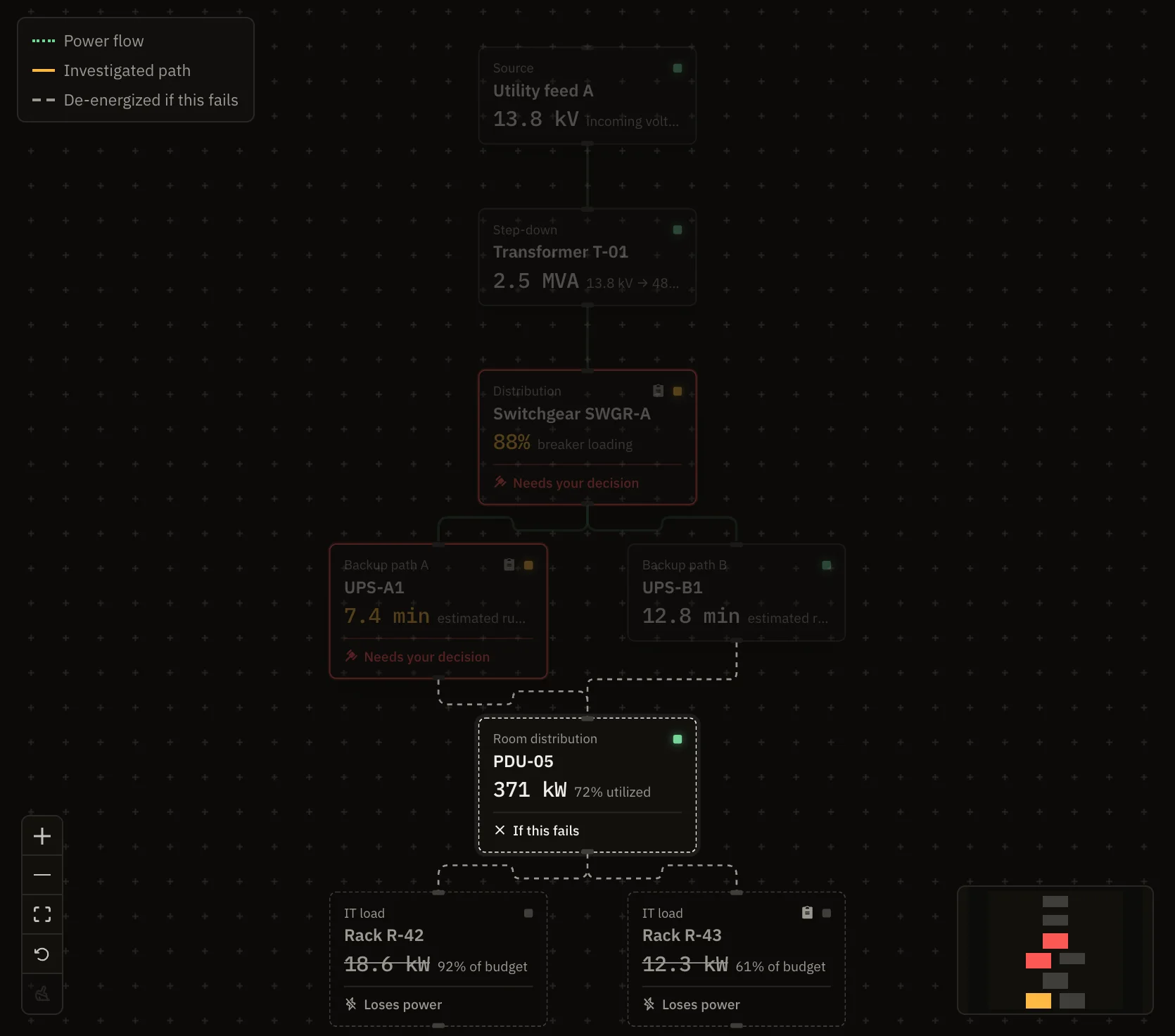
An earlier version drew the failure preview in dashed red. That gave red a second meaning right after the visitor learned it means "your call". Now the flow stops, the line turns to gray dashes, and the asset goes dark. A dark rack is what losing power looks like.
If UPS-A1 fails
If PDU-05 fails
React 19, TypeScript, Vite, and React Flow. The interesting parts are not the stack.
React Flow in controlled mode hands position changes to a callback, and the app passed none, so every drag was discarded. I found it by reading the library's triggerNodeChanges source, then confirmed it by dragging a node 86 pixels and measuring that it had not moved. PrincipleNever ship an affordance you cannot honor.
The preview removes the selected asset and reruns reachability from the utility source. Unreachable means it loses power. Still reachable downstream means redundancy holds it. The numbers stay honest if the topology changes.
The host rewrote every unmatched path to the app shell, so a missing asset returned HTML with a 200. During a rollover the browser refused it and rendered nothing. Assets now return a real 404, hashed files are immutable, and the entry page revalidates. I caught it by loading the deployed site and reading the console, not by trusting a green build.
Nodes are keyboard selectable. Tabs follow the standard arrow-key pattern. Dialogs trap focus, and the tour card joins that loop. All continuous motion stops under the reduced motion preference, and every colored state is also named in text.
In order. The first item is not a feature.
An open question, explored rather than answered. Nothing below is built.
If a facility were minutes from going down and the only person on site were the newest on the team, could an intelligence layer carry them?
Tax preparation, investing, software, and medicine all moved capability toward people with less training. I think the question is badly posed, because any operational act is four capabilities, and software moves them unequally.
Across fields, one pair of properties predicts whether the transfer works: how reversible the mistake is, and how fast the consequence arrives. Code assistants moved fastest because version control makes mistakes reversible. Driver assistance struggled at the handback, where the human is least practiced at the hardest moment. Neuron's approval gate is a handback too.
Hand capability downward in proportion to reversibility.
The counter-effect is Bainbridge's Ironies of Automation: the more a system absorbs the routine, the less practice people get for the exceptions. A tool aimed at the expertise shortage can deepen it.
So the realistic goal is not the novice as hero. It is the novice as competent first responder: do not make it worse, buy time, and get the right expert there faster with context. The decision record already does that pointed forward in time. Pointed sideways, it becomes an escalation packet.
I built it with an AI pair. I wrote the plans and acceptance criteria, gated each phase, checked every result in a real browser, and made every product and design call. The AI wrote most of the code. The interesting artifact is the sequence of decisions, including which of my own ideas to throw away.
A second pass redesigned it for my portfolio. The audience changed from an interviewer with me in the room to a visitor on their own. That one change drove the rest: an identity of my own, a graph that reads at a glance, motion that marks state, the guided tour, and a phone page. The principles and visual system are in the repository as PRODUCT.md and DESIGN.md.
Source is at github.com/trulou1028/neuron-shift.